Design patterns with API doc sites
In the previous topic, we browsed through a long survey of API doc sites and looked for similar patterns in their designs. “Design patterns” are common approaches or techniques in the way something is designed. Although one could probably identify many more patterns, the following design patterns are common with API doc sites: structure and templates, single seamless website, abundant code examples, lengthy pages, and interactive API explorers. I explore each of these elements in the following sections.
- Pattern 1: Structure and templates
- Pattern 2: A single seamless website
- Pattern 3: Abundant code samples
- Pattern 4: Lengthy pages
- Pattern 5: API Interactivity
- Some non-patterns in API doc sites
Pattern 1: Structure and templates
{: .note3} One overriding commonality with API documentation is that they share a common structure, particularly with the reference documentation around the endpoints. In an earlier section, we explored the common sections in API endpoint documentation.
From a tool perspective, if you have common sections to cover with each endpoint, it makes sense to formalize a template to accommodate the publishing of that content. The template can provide consistency, automate publishing and styles, and allow you to more easily change the design without manually reformatting each section. (Without a template, you could just remember to add the same sections on each page, but this requires more effort to be consistent.) With a template, you can insert various values (descriptions, methods, parameters, etc.) into a highly stylized output, complete with sophisticated styling.
Different authoring tools have different ways of processing templates. With Jekyll, a static site generator, you can create values in a YAML file and loop through them using Liquid to access the values.
Here’s how you might go about it. In the frontmatter of a page (for example, endpoints.yml), you could list out the key-value pairs for each section.
resource_name: surfreport
resource_description: Gets the surf conditions for a specific beach.
endpoint: /surfreport
And so on.
You could then use a for loop to cycle through each of the items and insert them into your template:
{% for p in site.endpoints %}
<div class="resName">{{p.resource_name}}</div>
<div class="resDesc">{{p.resource_description}}</div>
<div class="endpointDef">{{p.endpoint}}</div>
{% endfor %}
This approach makes it easy to change your template without reformatting all of your pages. If you decide to change the order of the elements on the page, or if you want to add new classes or some other value, you just alter the template. The values remain the same, since they can be processed in any order.
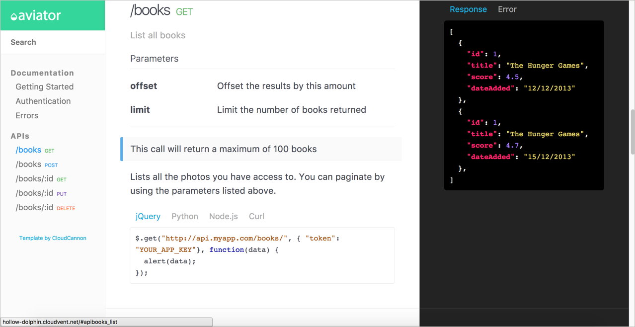
For a more full-fledged example of API templating, see the Aviator theme from CloudCannon. The sample endpoint for adding books in the Aviator theme looks as follows:
---
title: /books
position: 1.1
type: post
description: Create Book
right_code: |
  ~~~ json
  {
    "id": 3,
    "title": "The Book Thief",
    "score": 4.3,
    "dateAdded": "5/1/2015"
  }
  ~~~
  {: title="Response" }

  ~~~ json
  {
    "error": true,
    "message": "Invalid score"
  }
  ~~~
  {: title="Error" }
---
title
: The title for the book

score
: The book's score between 0 and 5

The book will automatically be added to your reading list
{: .success }

Adds a book to your collection.

~~~ javascript
$.post("http://api.myapp.com/books/", {
  "token": "YOUR_APP_KEY",
  "title": "The Book Thief",
  "score": 4.3
}, function(data) {
  alert(data);
});
~~~
{: title="jQuery" }
(The ~~~ are alternate markup for backticks ```. The notation {: .success } is kramdown syntax for custom classes.) The theme author created a layout that iterates through these values and pushes the content into HTML formatting. If you look in the Aviator’s index.html file, you’ll see this code:
{% assign sorted_collections = site.collections | sort: "position" %}
{% for collection in sorted_collections %}
  {% assign sorted_docs = collection.docs | sort: "position" %}
  {% for doc in sorted_docs %}
     <section class="doc-content">
       <section class="left-docs">
         <h3>
           <a id="{{ doc.id | replace: '/', '' | replace: '.', '' }}">
             {{ doc.title }}
             {% if doc.type %}
             <span class="endpoint {{ doc.type }}"></span>
             {% endif %}
           </a>
         </h3>
         {% if doc.description %}
         <p class="description">{{doc.description}}</p>
         {% endif %}
         {{ doc.content | replace: "<dl>", "<h6>Parameters</h6><dl>" }}
         </section>
         {% if doc.right_code %}
         <section class="right-code">
           {{ doc.right_code | markdownify }}
         </section>
         {% endif %}
       </section>
       {% endfor %}
{% endfor %}
This code uses for loops in Liquid scripting to iterate through the items in the docs collection and pushes the content into the HTML styles of the template. The result looks like this:
Note that this kind of structure is really only necessary if you have a lot of different endpoints. If you only have a handful, there’s no need to automate the template process.
I provided details with Jekyll only as an example. Many of the web platforms and technologies used for API documentation implement a similar templating approach.
When I worked at Badgeville, a gamification startup, we published using Drupal. We had a design agency construct a highly designed template in Drupal. To publish the API reference documentation, engineers wrote a custom script that generated the content from a database into a JSON file that we then imported into Drupal. The import process populated various fields in the Drupal template.
The resulting output was an eye-popping, visually appealing design. To achieve that kind of style in the UX, it would have certainly required a lot of custom div tags to apply classes and other scripts on the page. By separating the content from the template format, we could work with the content without worrying about the right style tags and other formatting. As you look for documentation tools, keep in mind the need to templatize your API reference documentation.
Although it can be fun to create your own templates (if you like to tinker with doc tools), you can probably already see problems related to custom templates. The templates are entirely arbitrary, with terms and structure based on the designer’s perceived needs and styles. If you write documentation to fit a specific template, what happens when you want to switch themes or products? You’d have to create new templates that parse through the same custom frontmatter. It’s a lot of custom coding.
Given that REST APIs follow similar characteristics and sections, wouldn’t it make sense to create a standard in the way APIs are described, and then leverage tools that parse through these standard descriptions? Yes! That’s what the OpenAPI specification is all about. Earlier in this course, I explained several REST API description formats and then launched into an extensive tutorial for the OpenAPI specification. I provided a tutorial for reading the OpenAPI specification using Swagger UI, along with an activity to create your own Swagger UI.
My point here is that you shouldn’t be overwhelmed by the coding challenges around creating your own API templates. The Aviator theme shows one custom approach, and I highlight it here with code samples to demonstrate the complexity and custom-nature of defining your own templates. But this isn’t the only approach nor is it even the recommended approach.
Pattern 2: A single seamless website
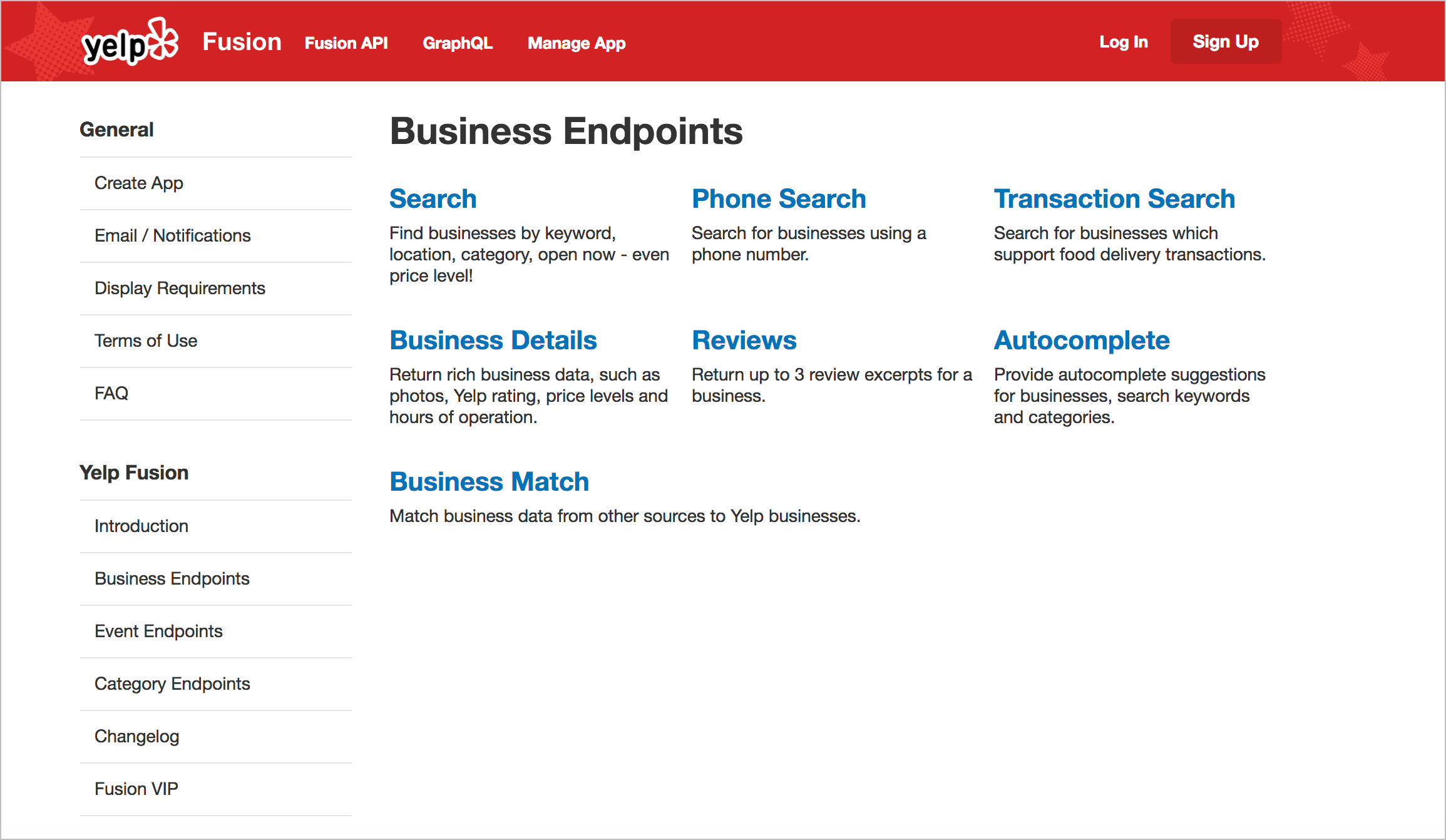
Many API doc sites provide one integrated website to present all of the information. You usually aren’t opening help in a new window, separate from the other content. The website is branded with the same look and feel as the product. Here’s an example from Yelp:
I hinted at this earlier (in Introduction to REST API documentation), but with API documentation, there usually isn’t a GUI (graphical user interface) that the documentation complements. In most cases, the API documentation itself is the interface that users navigate to use your product. As such, users will expect more from it.
One of the challenges in using documentation generated from OpenAPI and Swagger or some other document generation process is figuring out how to integrate it with the rest of the site. Ideally, you want users to have a seamless experience across the entire website. If your endpoints are rendered into their own separate view, how do you integrate the endpoint reference into the rest of the documentation?
If you can integrate the branding and search, users may not care. But if it feels like users are navigating several sites that are poorly cobbled together, the UX experience will be somewhat fragmented.
Think about other content that users will interact with, such as marketing content, terms of service, support, and so on. How do you pull together all of this information into a single site experience without resorting to an overbloated CMS or some other web framework?
The reality is that most API documentation sites are custom-designed websites that blend seamlessly with the other marketing content on the site because your API doc must sell your API. As a website platform (rather than a tripane help output), you can leverage all the HTML, CSS, and JS techniques available in building websites. You aren’t limited to a small subset of available tools that are allowed by a particular help authoring tool; instead, you have the whole web landscape and toolset at your disposal.
This open invitation to use the tools of the web to construct your API doc site is both a benefit and a challenge. A benefit because, for the most part, there’s nothing you can’t do with your docs. You’re only limited by your lack of knowledge about front-end coding. But it’s also a challenge because many of the needs you may have with docs (single sourcing, PDF, variables, and more) might not be readily available with most website tooling.
Pattern 3: Abundant code samples
More than anything else, developers love code examples, and the abundance of syntax-highlighted, properly formatted code samples on API doc sites constitutes a design pattern. Usually, the more code you can add to your documentation, the better. Here’s an example from Evernote’s API:
James Yu at Parse gives the following advice:
Liberally sprinkle real world examples throughout your documentation. No developer will ever complain that there are too many examples. They dramatically reduce the time for developers to understand your product. In fact, we even have example code right on our homepage. (Designing Great API Docs)
For code samples, you’ll want to incorporate syntax highlighting. The syntax highlighter colors different elements of the code sample appropriately based on the programming language. There are many syntax highlighters that you can usually incorporate into your platform. For example, Jekyll uses rouge by default. Another common highlighter is pygments. These highlighters have stylesheets prepared to highlight languages based on specific syntax.
Usually, tools that you use for authoring will incorporate highlighting utilities (based on Ruby or Python) into their HTML generation process. You don’t normally implement the syntax highlighter as a standalone tool. If you don’t have access to a syntax highlighter for your platform, you can manually add a highlighting using syntax highlighter library.
Another important element in code samples is to use consistent white space. Use a tool to format the code with the appropriate spacing and line breaks. You’ll need to format the code based on the conventions of the programming language. Fortunately, there are many code beautifier tools online to automate that (such as Code Beautify).
Sometimes development shops have an official style guide for formatting code samples. This style guide for code might prescribe details such as the following:
- Spaces inside of parentheses
- Line breaks
- Inline code comment styles
For example, here’s the Google JavaScript Style Guide. If developers don’t have an official style guide, ask them to recommend one online, and then compare the code samples against the guidelines in it. I dive more into code samples in Code samples and tutorials.
Pattern 4: Lengthy pages
One of the starkest differences between regular end-user documentation and developer documentation is that developer doc pages tend to be much longer. Why are the pages longer? In How API Documentation Fails (published in IEEE Software), Martin Robillard and Gias Uddin looked at common reasons why developers had severe problems with API documentation. In addition to incompleteness, ambiguity, and other reasons, the researchers also found that “fragmentation” was cited as a common issue (which is more related to the presentation of content than the content itself).
Robillard and Udin explain:
When the respondents had to click through multiple pages of an API document to learn the functionality and use of an API element, they found the separation of the descriptions at such a micro level to be unnecessary.
Developers in their survey said they “had difficulty navigating through the myriad pages in an API document to find information,” with one respondent explaining:
Fragmented documentation I find really difficult to use, where you have to have 10s of clicks through links to find the information you need, and page after page to read.
If you’re using an information model in your documentation that chunks information, make sure your presentation to the user doesn’t fragment the content into too many discrete pieces (as I wrote about in Does DITA Encourage Authors to Fragment Information into a Million Little Pieces?).
James Yu at Parse also echoes similar feedback about fragmentation. He says,
It’s no secret that developers hate to click. Don’t spread your documentation onto a million different pages. Keep related topics close to each other on the same page.
We’re big fans of long single page guides that let users see the big picture with the ability to easily zoom into the details with a persistent navigation bar. This has the great side effect that users can search all the content with an in-page browser search.
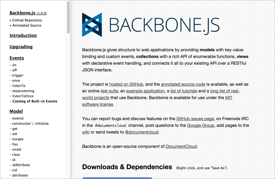
A great example of this is the Backbone.js documentation, which has everything at your fingertips. (Designing Great API Docs)
The Backbone.js documentation takes this length to an extreme, publishing everything on one page:
For another example of a long page, see the Reddit API:
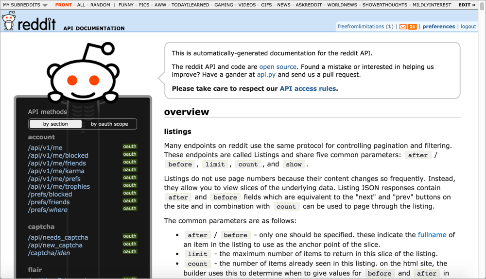
Why do API doc sites tend to have such lengthy pages? Here are a few reasons:
- Provides the big picture: As Yu indicates, single-page docs allow users to zoom out or in depending on the information they need. A new developer might zoom out to get the big picture, learning the base REST path and how to submit calls. But a more advanced developer already familiar with the API might need only to check the parameters allowed for a specific endpoint. The single-page doc model allows developers to jump to the right page and use Ctrl+F to locate the information.
- Many platforms lack search: A lot of the API doc sites don’t have good search engines. Many lack built-in search features altogether. This is partly because Google does such a better job at search, the in-site search feature of any website is often meager by comparison. Also, some of the other document generator and static site generator tools don’t have search (neither did Javadoc). Without search, you can find information by creating long pages and using Ctrl+F.
- Everything is at your fingertips: If the information is chunked up into little pieces here and there, requiring users to click around constantly to find anything (as is often the case with DITA’s information model), the experience can be like playing information pinball. As a general strategy, you want to include complete information on a page. If an API resource has several different methods, splitting them out into separate pages can create findability issues. See Single Page Docs: Stop the Click Insanity by Brandon Philips for more. Sometimes it makes sense to keep all related information in one place, with “everything at your fingertips.” This is the approach the authors of the OpenAPI spec on GitHub took — one endless page, with the ability to use Ctrl+F to jump around easily.
- Today’s navigation controls are sophisticated: Today there are better navigation controls today for moving around on long pages than there were in the past. For example, Bootstrap’s Scrollspy feature dynamically highlights your place in the sidebar as you’re scrolling down the page. Other solutions allow collapsing or expanding of sections to show content only if users need it.
Usually the long pages on a site are the reference pages. Personally, I’m not a fan of listing every endpoint on the same long page. Long pages also present challenges with linking as well. However, I do tend to create lengthier pages in API doc sites than I typically see in other types of documentation.
Pattern 5: API Interactivity
A recurring feature in many API doc publishing sites is interactivity with API calls. Swagger UI, Readme.com, Apiary, and many other platforms allow you to try out calls and see responses directly in the browser.
For APIs not on these platforms, wiring up an API Explorer is often done by engineers. Since you already have the API functionality to make calls and receive responses, creating an API Explorer is not usually a difficult task for a UI developer. You’re just creating a form to populate the endpoint’s parameters and printing the response to the page.
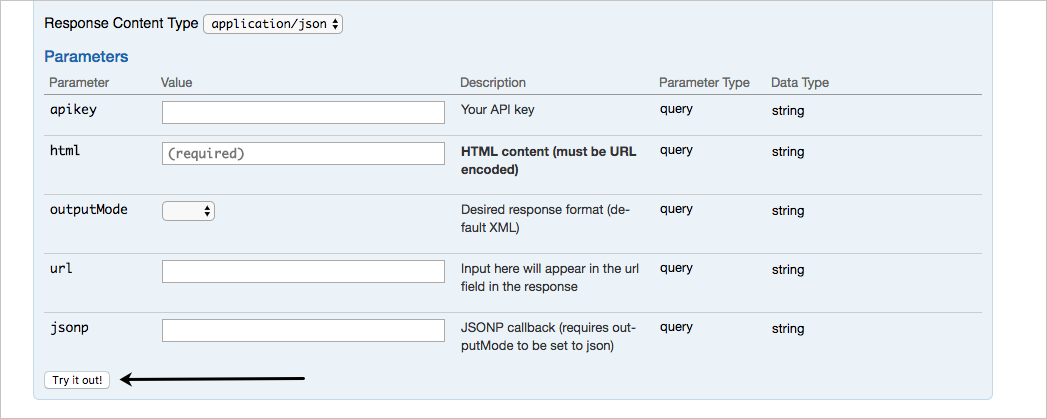
Here’s a sample API explorer from Watson’s AlchemyLanguage API that uses Swagger or OpenAPI to provide the interactivity.
Are API explorers novel, or instructive? If you’re going to be making a lot of calls, there’s no reason why you couldn’t just use curl or Postman (particularly the Postman Run Button) to quickly make the request and see the response. However, the API Explorer embedded directly in your documentation provides more of a graphical user interface that makes the endpoints accessible to more people. You don’t have to worry about entering the right syntax in your call — you just have to fill in the blanks.
However, API Explorers tend to work better with simpler APIs. If your API requires you to retrieve data before you can use a certain endpoint, or if the data you submit is a JSON object in the body of the post, or you have some other complicated interdependency with the endpoints, the API Explorer might not be as helpful. Nevertheless, it is a design pattern to provide this kind of interactivity in API documentation.
If your users log in, you can store their API keys and dynamically populate the calls and code samples with API keys. The API key can most likely be a variable that stores the user’s API key. This API-key feature is provided with sites like Readme.com.
However, if you store customer API keys on your site, this might create authentication and login requirements that make your site more complex to create. If you’re creating this experience in a custom way, you’ll probably need the help of a front-end designer and web developer.
Some non-patterns in API doc sites
Finally, I’d like to briefly mention some non-patterns in API documentation. With many API documentation sites, you rarely see any of the following:
- Video tutorials
- PDFs
- Commenting features
- Localization
- Single sourced outputs for different roles
These might even be considered “non-patterns” in API doc sites. By non-patterns, I’m not saying these elements aren’t a good idea, but generally they aren’t emphasized as primary requirements in API documentation. If you get pressure to provide these outputs as part of your documentation requirements, look around to see how other API doc sites deliver it. Their frequent omission might inform your own decision and provide some support to make a case for or against the requirement.
94/145 pages complete. Only 51 more pages to go.

